Sunday, November 28, 2010

Diamine Graphite Fountain Pen Ink: Life is only shades of grey.

This is the most "boring" ink I have. For some reason, though, I like it! Perhaps it's non-conformist nature is what entices me. It isn't black, but it's not a "color". Ooohhh, the mystery! A pen-friend wrote me with this ink, and well, I just fell in love! I purchased a bottle, but apparently Diamine had some issues with early batches of it. I got an early bottle. The suspension wasn't right, and my ink had separated into oily looking stuff and pigment, gross! So, my pen friend had sent me a sample, and that is what I used for this review. 
There's really not much to say about grey, other than I spell it with an "e" instead of an "a", because I like they way it looks better. Grey is, well, grey. This particular shade is dark enough to read, but not dark enough to be confused with black. That's what I like about it. At my desk, at night (which is when I am awake), it has just a HINT of green to it. That doesn't show up in this scan at all, so I am assuming it is just the lighting, and not the ink. The shading is pretty nice, and dry time isn't too bad. This ink did seem a little dry in my Medium-nibbed Safari, but I think it had kind of worked itself out with more use. The color seems to have darkened just a bit too. 
I really like this ink, but since my bottle was wonky, I think I am going to get Noodler's Lexington Gray as an exchange. I love this ink, but I could do with just a shade or two darker. As the rain has been frequenting Cincinnati, I am also finding that I need to break down and get a waterproof ink.

*I would like to sincerely thank fellow FPN'er and pen-pal tawanda for giving me this sample!*

EDIT to add comparison pictures to Noodler's Lexington Gray.


Shay.

It's Beginning to Look a Lot Like Christmas: Private Reserve Ebony Green Fountain Pen Ink

Well my friends, Shaylen Scrooge is actually feeling a bit Christmas-y this year. Given all the drama of the past few months, that in and of itself is a monumental feat. Typically, even under normal circumstances, the Holidays are a difficult time of year for me. It seems like it only reminds me of my lack of family, and finances. Alas, as 2010 rolls to a stop, I intend to Ho Ho Ho the halls with boughs of holly, or...something like that.
Anyway, in true Christmas fashion, I wanted to review this pretty green ink.  I made out my Christmas cards last night, and used it for some of the personal notes I included. This is a very professional looking, well behaved ink. I know this ink has to flow exceptionally well, because the pen I am using it in has never worked for me before! It's just a crappy fountain pen from a cheap pen set, but now that it is working, it's not that bad!

It does dry pretty slowly, and is most certainly not water-proof. It's a very pretty color though, just spot-on for the rich, dark, emerald green you want for Christmas correspondence. At least, it is in my opinion. Here's a close-up of the swab:

If you're a fan of green, or looking for something to spice up your "blue or black ink only" life, I recommend this ink!

Season's Greetings,
Shay.

Wednesday, November 24, 2010

Before Fall Completely Slips Away: Diamine Blaze Orange Fountain Pen Ink

I love fall colors! Orange is especially fun because it means Halloween, pumpkins, and the Cincinnati Bengals. I'll avoid my diatribe about how the Bengals suck this year (though I'm still a fan), and skip straight to the inky commentary.
Diamine Blaze Orange is a very lovely ink! The color is a very nice bright orange. This one doesn't lean too much toward yellow, red, or brown, and stays a true clean orange. The shading is quite noticeable and very pleasant. This ink would probably be too light for some people's tastes, and simply just "too loud" for others. I think it is quite readable, but you certainly couldn't use it for much besides personal correspondence or journaling. You might even be able to get away with using this as a highlighter ink, but I haven't tested that theory. It is not supersaturated, but it is very vivid. I really like this ink!!!


Happy Thanksgiving,
Shay.

Tuesday, November 23, 2010

Quick word

I am hoping to get some new reviews up soon. Some of you may know, others may not, but our little boy Bosco had to have knee surgery and get neutered this past Friday. He is doing well, but keeping him calm is a full time job- with mandatory overtime. That, coupled with two family Thanksgiving celebrations this week mean very little free time.  Fear not, dear readers, I have not forgotten ye, I have just been busy with things that are slightly more important.
Shay.

Wednesday, November 17, 2010

Another "Blood Red" Ink: J. Herbin 1670 340th Anniversary

So this ink is (as far as anyone knows) only to be produced in 2010, as J. Herbin celebrates their 340th anniversary. You never would have guessed that from my title, would you? J. Herbin is a French, world-renowned ink and wax producer that has been around for, well, 340 years. This ink is also known as Rouge Hematite, citing a blood-red coloring.
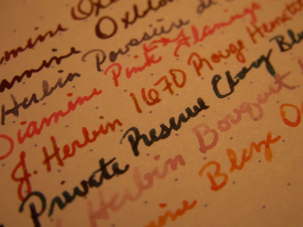
I had very high hopes for this ink, and while they weren't completely dashed, they weren't fulfilled either. You see, this here ink has some gold in it... not real gold, per se, but metallic gold flecks/specks/particles. THAT is what makes this ink so interesting to me. Otherwise, it would just be red. Well, I had heard reports that these little gold beasties don't make their way onto paper, and not to count on that. On the contrary, I had seen many examples online of ink with the gold "halo" effect front and center. What was I to do? Not get any and later regret it when it is no longer available? Pish-posh!
So, I bit the bullet and anteed up the $22 I paid for 50mls of this stuff. Too much? Yes, but not by a lot, considering it may no longer be produced in a month or so.
I loaded this stuff into a Safari (with 1.1, 1.5, B, and M nibs)...and no gold. Curses! A dip pen tells another story. The red was much more dark and prettier, and the gold could be seen! I don't really like writing with dip pens though. Le sigh.
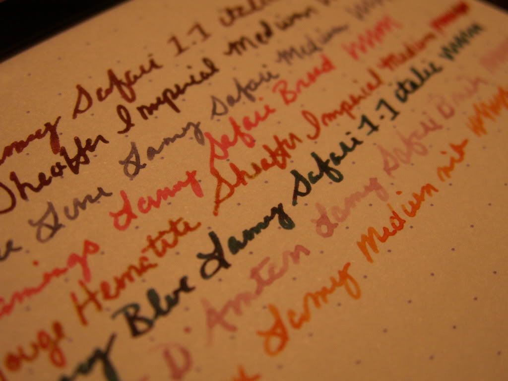
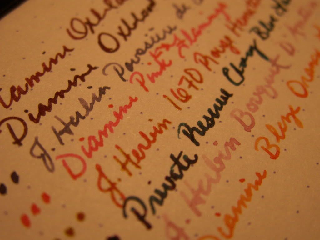
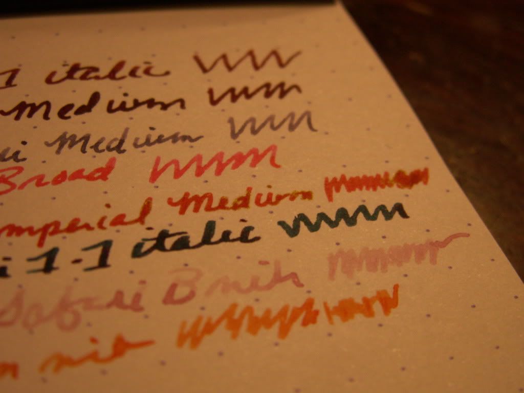
A few days after I got this ink, I got my Sheaffer Imperial in the mail. WOW- does this thing put down a lot of ink! I now had a little bit of restored hope that I could get the gold to flow from a fountain pen nib. So, yesterday, I loaded the 1670 up in the Sheaffer. It was mediocre at best. No really apparent gold. It might be there, if you squint a lot, and it was a really wet stroke of ink. Maybe. This next photo proves I am not crazy, that there is some "gold" there... it just isn't coming out of a fountain pen nib. 
The ink is fine to write with. It flows smoothly, doesn't feather, or bleed-through. But honestly, from a fountain  pen (or at least the ones I have) it is just red. Not even a pretty red like Diamine Oxblood; just plain ol' red. It dries really slowly, and is super saturated. It is not waterproof at all, but I don't think anyone expected it to be.

Now- it was dark outside when I prepared this review, and my scanner has been crappy as of late, so this is the best I could do for getting a picture. You get the gist, though. Besides, any of you who care about this have probably seen a million other examples of this ink. I do believe that it is worth noting that the dip pen sample in the above picture does show what I wanted this ink to look like. The gold almost gives it a greenish cast.
So- do I love it? No.
Do I hate it? No.
Would I buy it again? Probably not, especially for $20-$22.
Well, do you regret buying it, Shaylen? Not really. I will probably only use it for "love letters" written with a dip pen, but the hoarder in me is glad I got some while I had the chance.

Edit: Added more pictures, more "gold" evidence, and a picture actually taken during the day.
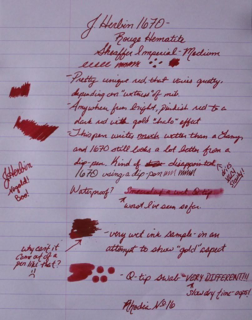


Another Edit to add one more picture of this elusive gold:


-Shay.

Tuesday, November 16, 2010

Diamine Oxblood Fountain Pen Ink

This ink is exactly what I wanted it to be. It is currently my favorite, and even though I have plenty of new offerings waiting in the wings, I've inked up with Oxblood twice in a row. I was lucky enough to have a friend send me a written sample of this ink before purchasing it, so that I could see it in person. I am so in love with the color, it looks just like fresh, oxygenated blood. It is an absolutely gorgeous dark red, great for Fall and the Holiday Season. There is enough "blue" to this to make it a brilliant, true red, and keep it from leaning towards brown. There's also not so much blue that this leans toward burgundy or purple.
Flow is very good with this ink, especially in the Sheaffer Imperial I put it in today. There is no feathering or bleed-through in a Lamy Safari 1.1 italic nib, but my medium Sheaffer nib is so wet that it does feather very slightly on Rhodia. Dry time is not great, but not really much worse than any other ink I've used. Waterproof-ness is on par for a non-waterproof ink. This is a super saturated, dark ink, so shading isn't very apparent.

I can't say enough good things about this ink, it matches my new pen wonderfully, and the two together put me on cloud nine.


I will most certainly be using this ink for Christmas cards, and lots of personal correspondence and journal entries. I wouldn't really deem it appropriate for business use, but if you use red ink to edit or annotate, this would be an excellent option for something just a bit off the beaten path. If you're a pen-pal of mine, you may have already seen this ink. If not, expect to! =)
This ink came from the lovely Goulet Pen Company (who, though not affiliated, I also cannot say enough good things about).


Saturday, November 13, 2010

(Rose) Rage Against the Machine

Thankfully, I like one of Private Reserve's newest inks much better than I like that band. Rose rage is absolutely pink. To me, it lies somewhere in between Pepto and neon pinks. It is much more neon and concentrated from a dip pen than from my Lamy Safari. I assume the exact shade you get will depend on how wet your chosen instrument writes. My scanner isn't capturing colors like I would like it to, so I actually took pictures of these pages in direct sunlight.
There was no feathering or bleed-through, and the ink flow was excellent. I didn't have any issues getting it to start at all once it was loaded in the pen. I have had to fight with other inks to get them rolling, but this was not the case with Rose Rage. It isn't waterproof, but it held up better than I expected it to. Dry time wasn't great and wasn't terrible. I did the "highlighter test" that some people were curious about seeing with this ink. I just basically scribbled over a black Sharpie pen sample with the Safari, but I think in a highlighter pen this could work well. The writing underneath is legible, and didn't smear, though that may be a credit to the Sharpie pen, not the Rose Rage. 
Here is a list written with a dip pen where you can see Rose Rage with a bunch of other reds and pinks. Do keep in mind that these all look very concentrated (and that my writing with said pen is terrible). 
Overall, I like this ink pretty well. It behaves and is a fun, bright color. I don't think I'll be using it much this time of year, but it will definitely make it into the rotation come Spring and Summer. 


Friday, November 12, 2010

A preview of the inks I will be reviewing

I received a bunch of new inks in the mail today, and I will be reviewing the new ones as they are loaded into my pens. Here is a little taste!

Stay tuned,
Shay.

Tuesday, November 9, 2010

Exciting things to come!

Just a brief update:
I have many inks coming in the mail this very second! I am anxiously awaiting their arrival! I will also be getting some new paper products and pens as well. If you're so inclined, stay tuned for many more updates to come! Hopefully, I'll have something new for you starving readers of mine (all three or four of you) by this weekend.
Ciao,
Shay.